New Look…

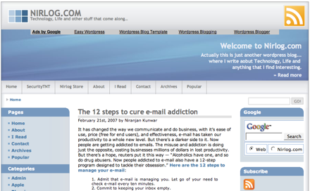
If you’re reading this in your RSS reader, just wanted to let you know that I’ve changed the look at Nirlog.com. Now I’m using a new theme WP-Multiflex-3, by Ainslie Johnson. My previous theme called WP-Andreas09 was also by Ainslie. I like the new theme, and I think many blogs will be using it, but I’m one of the first to have it, so I don’t mind ;). It supports Widgets, the cool thing is that the header too is widgetized in 3 sections, top, middle and bottom, which can be placed where you want or left out if you don’t want them. The theme is also SEO friendly, where space is left for your “keywords” and “descriptions” in header.php, and title appears before the the blog’s name. I love the RSS Subscription button at the header too.


Very nice theme! I too love the rss button at the top 🙂
Congratulation…………………
Party Time……. yuppppy…………………
Looks nice. You tend to change the look often. But I feel like you should put the Google Adsense on the blog post a little down, at least after one paragraph of the entry.:-)
Thanks guys…, I understand what you mean Ujjwal, actually I’m experimenting how effective the ads are at different positions :). Currently the adsense floats on the left of the content on normal posts, but it appears before the content when there’s a large image at the beginning of the post (like this one).
I just realised that the layout looks fine in Firefox but not in Safari. Any ideas?
Re adsense: I have my adblock plugin permanently on in Firefox and PithHelmet permanently on in Safari, so can’t see a single ad. sorry!
Thanks for that Mahesh, I forgot to check it with Safari, and you’re right it doesn’t display well on it. I’ve written to the author of the theme, hopefully he’ll fix it soon.
I like your way of blocking the ads and browsing productively, without any distractions. That’s smart, I think!
I’ve just applied the new style sheet updated by Ainslie, and the site looks fine in Safari now. Thanks Mahesh for alert and Ainslie for prompt fix.
Excellent! It looks fine on my Safari too 🙂